Chinese Calligraphy Brushwork: Reading and Practising the Living Line
书法笔法:观察与练习有生气的线条
Brushwork becomes easier to discuss when we separate three questions: what is visible on the page, what movement might have produced it, and what a particular model asks us to learn. They are related, but a finished mark does not reveal every detail of the hand that made it.
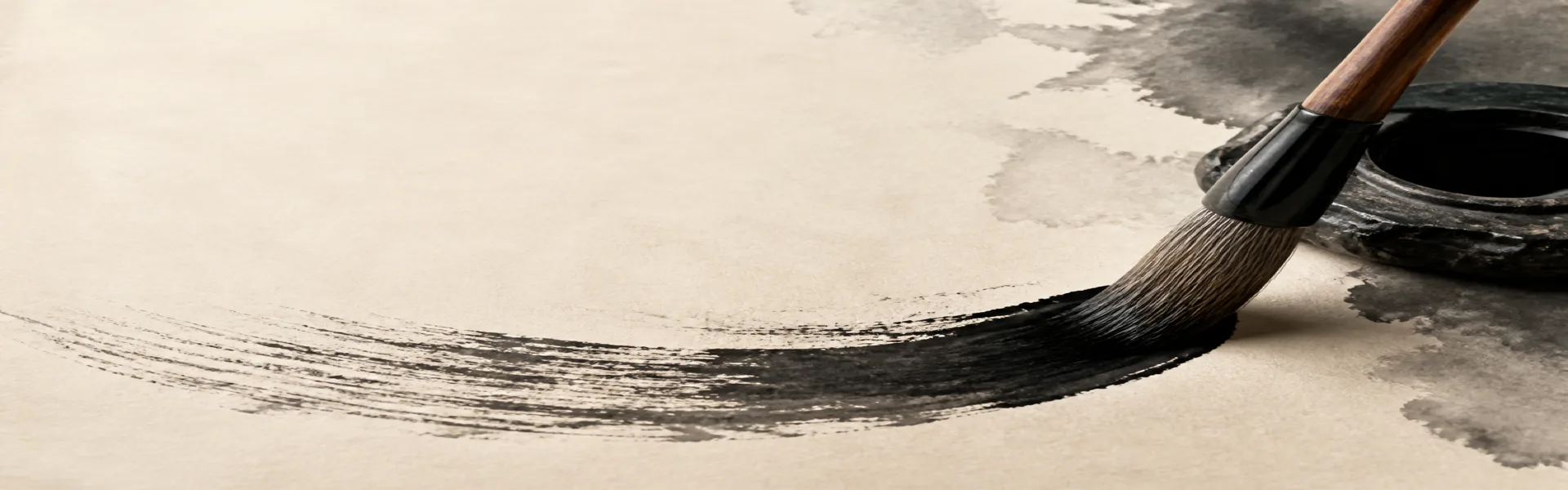
This guide offers a vocabulary for looking and a modest way to practise. It is not a substitute for a teacher watching your movement, and it does not turn one grip, one posture or one style into a rule for all Chinese calligraphy.
Begin with an identified model
Choose a legible model with a known title or catalogue description. Note whether you are looking at ink on paper, a tracing, a rubbing or a photograph of another object. Wear, printing and reproduction can alter the edges that seem to tell you how the brush moved.
Look at the whole work before isolating a favourite stroke. Ask what kind of writing it is, how large it is and how the support shapes its arrangement. A fan, a long handscroll and a small study sheet do not pose identical spatial problems.
Grip and support are practical choices
In a lesson, ask the teacher to explain the grip and arm support being demonstrated for that exercise. Try to understand how the arrangement allows movement, not just how the fingers look. A photograph of a hand is not enough to establish the writer's pressure or range of motion.
Work in a comfortable position and adjust the scale or support if needed. Do not treat a fully suspended arm as a compulsory destination for every learner, or continue through discomfort to prove seriousness. Fingers, wrist and arm need not be described as rival sources of movement.
Notice contact, ink and movement together
As the brush meets the paper, the amount and direction of contact help shape the mark. Pressure, movement and ink load interact with the paper. A broad stroke is therefore not a simple pressure reading, and a narrow stroke does not by itself prove that the writer moved quickly.
For a small trial, keep the paper and ink consistent and compare a few manageable changes in contact. Notice the result rather than forcing the brush to make an ideal shape. The Four Treasures guide explains how to compare materials without changing everything at once.
Centre-tip and side-tip: terms to investigate
Zhongfeng, often called centre-tip brushwork, describes the tip's travel within the stroke; cefeng, or side-tip brushwork, directs attention to a more lateral use of the brush. A useful demonstration shows how contact changes during movement, not merely an upright or tilted shaft frozen in a picture.
The Met describes the fan below in terms of rounded, centred-tip strokes. Compare a few marks with that description, then look at the spaces around them. Do not assume that every rounded-looking edge lets you reconstruct the exact movement.
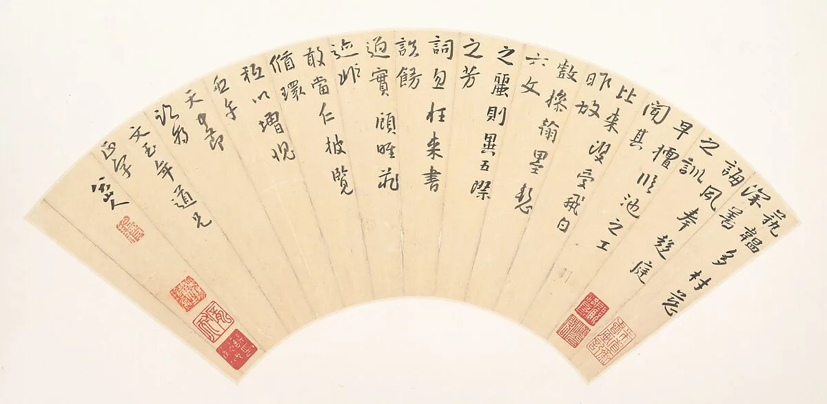
Bada Shanren (Zhu Da), Letter by Li Zhi, 1702. Ink on paper. The Metropolitan Museum of Art, Bequest of John M. Crawford Jr., 1988; 1989.363.139. Public domain. Collection record
Entry, travel and exit as a reading framework
Try dividing a selected stroke into its beginning, its course and its ending. Is the beginning pointed or contained? Where does the direction or width change? Does the ending gather, taper or lead towards another mark? These questions are a framework for observation, not a requirement to stop three times.
Concealed and exposed beginnings, rounded turns and angular changes can be discussed in relation to a specific model. Do not infer that one is always correct or that combining angular and rounded forms is inherently a mistake. Ask what role each plays in this piece.
Dryness and flying white are not speedometers
Feibai, commonly translated as flying white, concerns uninked passages within brush marks. Dry-looking texture may involve ink load, contact, movement and the surface. Looking at a reproduction alone does not give an exact writing speed or a reliable test of whether the effect was deliberate.
A planned dry-brush effect is not automatically a fake. First describe what you see, then consider the artist's choices and the catalogue's evidence. Avoid turning a preferred texture into proof of authenticity, skill or lack of training.
What might a living line mean?
Words such as lively, strong or restrained are judgments that invite explanation. Ask a teacher or a catalogue which visible qualities support them: continuity through a turn, a change of density or the relation between a stroke and the surrounding space. Compare the term with the actual work.
There is no need to treat every relatively even-width line as lifeless. Nor should metaphors of force become instructions to press hard enough to damage paper. Critical language is most useful when it helps you see a distinction rather than replacing observation with a slogan.
From one character to a whole composition
Within a character, compare the positions, proportions and intervals of its parts with the chosen model. Then step back to look at changes in size, the direction of columns, margins and the relation of writing to the support. Avoid imposing a fixed dominant stroke or identical proportions on every character.
In the illustrated fan, the available space changes across the curved surface. Ask how the columns and open areas respond to that shape. This exercise is about the composition you can see; it does not require you to identify every seal or invent a reading of unfamiliar characters.
Practise with a clear purpose
Tracing a suitable reproduction, copying with a model beside you and writing a remembered passage ask different things of the learner. Choose a method for a specific purpose and return to the model to check what changed. They need not become a universal ladder that everyone must climb in the same order.
For one session, select a short passage and one feature to study. Make an attempt, compare it, then try again. Keep the sheets and label the model used. If you trace, use your own working reproduction, never an original object or a borrowed page that could be damaged.
Ask for feedback that can be used
Instead of asking only whether a page is good, ask where the movement lost continuity, which interval differs from the model or how a material change affected the result. A teacher can then demonstrate one adjustment that you can try and compare.
Continue with the five-script guide for the different writing families, or the Four Treasures guide for tools and materials. The calligraphy overview brings the learning paths together. Let technique support closer looking, not become a list of rules detached from actual works.